We've launched a Tiny Changes shop, with 100% of profits going directly towards helping young minds feel better.
Shop NowWe've launched a Tiny Changes shop, with 100% of profits going directly towards helping young minds feel better.
Shop NowPublished on 09.07.20
Over the last six months we’ve been working with sustainable design studio ilka to rebrand Tiny Changes. We asked the founders; Lisa and Laura to share their thinking and design process behind the new look.
“When we were approached by the trustees about a rebrand we must admit we were nervous. Not only is mental health a cause close to our hearts but we are also huge fans of Frightened Rabbit. So much of Scott was entwined within the current brand. The logo was even Scott’s handwriting. We didn’t want to lose any of his character, as Tiny Changes is after all his legacy, but we knew we had to take the brand in a new direction to be more appropriate for its audience and message.
With Tiny Changes supporting young people aged 0-30 we had quite a large demographic to appeal to. Not only this but the conversations led by Tiny Changes meant that they needed a brand that would support them through difficult narratives one day but could also demand action the next. We didn’t want to alienate any of the valued support the charity already has but we had to create a trustworthy brand that could evolve with its new growing audience. We set out to create something that was honest, reliable and open.
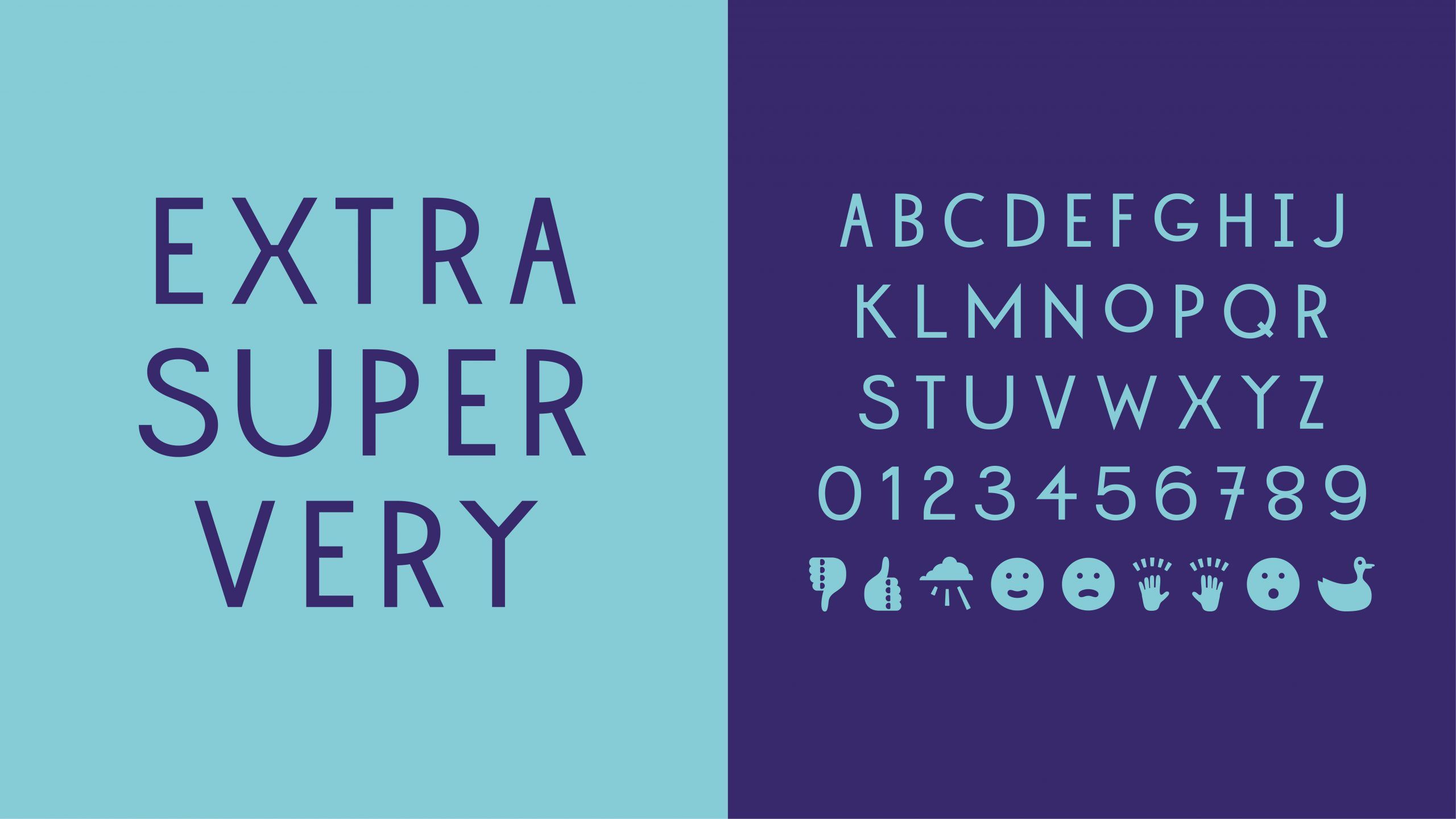
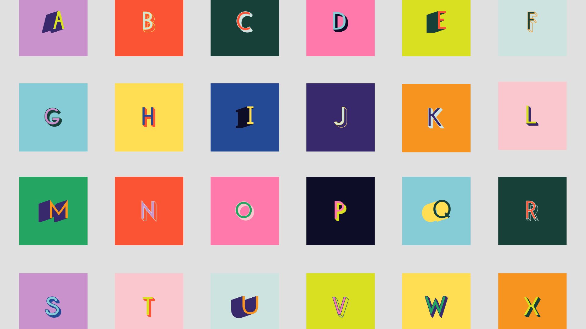
Our idea began with the development of a bespoke typeface inspired by Scott’s handwriting. He had a brilliant way of drawing type so that it almost became an artwork. This uppercase and bold style of typography was more youthful and impactful than his lowercase handwriting and felt the perfect fit for the new direction of the charity.
Working with typographer Mitchel Gillies we developed an alphabet, including letters and icons, to bring Scotts characters to life. The trustees expertly named the typeface Extrasupervery, influenced by the song on the bands first album Midnight Organ Fight, and so this was the foundation of the new brand.
Knowing that we had a more playful typeface we developed a logo that would work as a stamp of trust. It had to be legible at small sizes and look powerful. Tiny Changes may be a small charity but they make a big impact.
For body copy we chose a beautiful typeface called Chromatica, which supports legibility for young readers but also harks back to the trustees roots in the Scottish Borders as it was developed by Polytype; a type foundry run by Lewis MacDonald from the Scottish Borders.
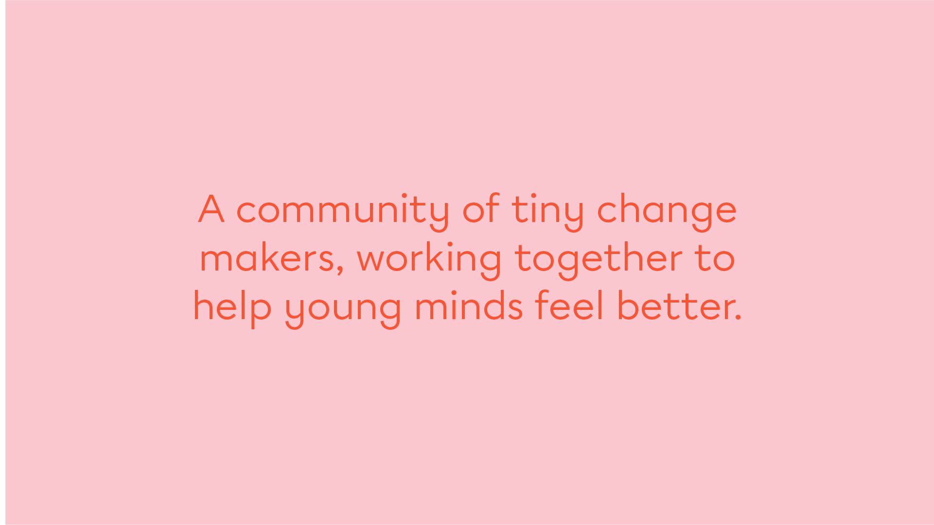
Scott’s lyrics were medicine to many. Words can hurt but they can also heal and we knew language would be an essential part of this brand. We worked closely with the trustees to develop tone of voice, vision and mission statements and key messaging to create consistency across communications from the website to social media. Scott’s core values of honesty, bravery, kindness and most importantly hope lie at the heart of everything Tiny Changes communicates.
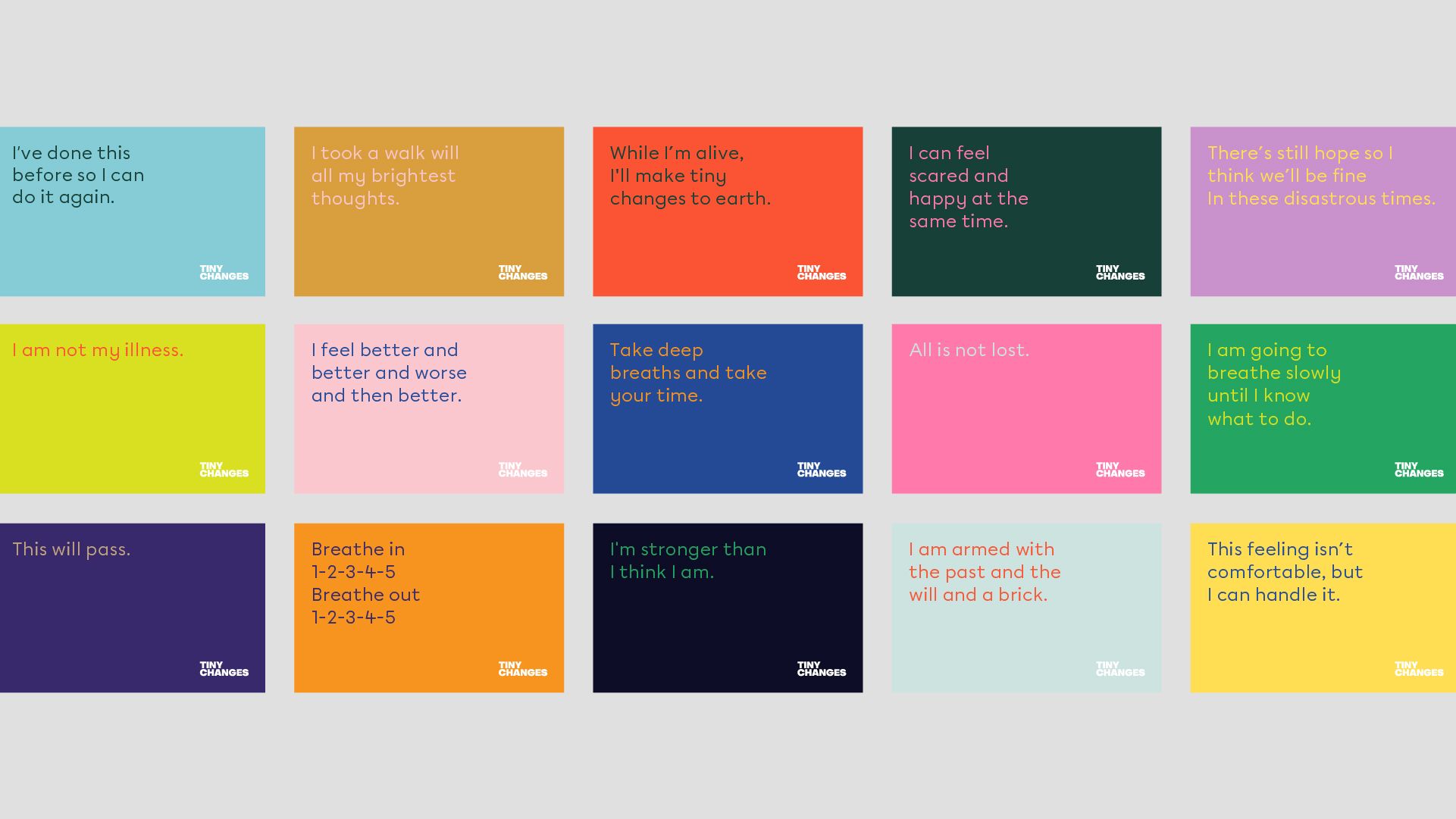
Styling and colour play a huge role across the brand to create different moods to match different conversations. This flexibility really opens up the dialogue. Pastels and simple type evoke sensitivity, empathy and understanding, where as a more vibrant palette with styled typography conveys energy and activism. No conversation is off limits.
With all this created we felt there was still a key part of the brand missing…our audience. By creating key applications that allow tiny change makers to contribute in their own way we can really listen to and learn from each other to be the change we want see. Our Tiny Changes alphabet and series of coping cards are just a few things we have in store for you so watch this space. Together, we’ll make tiny changes to earth.
For the full brand guidelines click here or for more work from ilka click here.